6 Illustration trends currently dominating the creative marketing scene
24th June 2022
Visual trends come and go in the blink of an eye. But, that’s not to say we shouldn’t make the most of them while we can. Illustration is a great form of visual that can magnify a creative campaign. If you’re not already using illustrations in your content marketing, I suggest you visit our blog on why you should be.
Thanks to our talented team of creatives, we have composed a collection of illustration trends to step up your content.
Using various textures
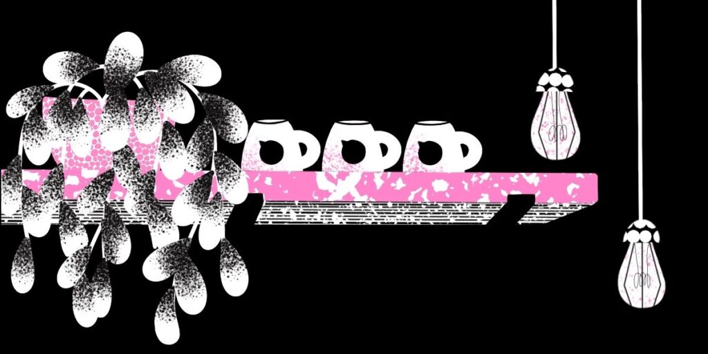
Before the digital age, printing various textures in the right manner was more of a hindrance than a help. However, now that design has expanded to digital media, using textures in illustrations can create the illusion of realism.
Textures are making a big comeback within illustration trends this year, adding dimension to pieces and allowing designers to experiment with their creativity. Whether used on backgrounds or auxiliary elements, using texture can make the illustration look more realistic whilst maintaining elements of artistry.
Hand-drawn illustration
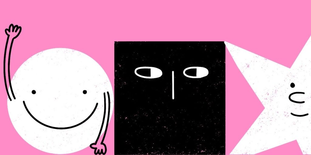
Traditional art is a timeless classic. However, in the age of digital marketing and social media, businesses were rarely taking the traditional route for branding and content.
This year, we have seen an increase of hand-drawn (or digitally made imitating traditional materials) illustrations in content and branding. Hand-drawn art is unique and brings a personal touch to brand communication due to its rawness and imperfections.
Combining illustration and animation
Video content is becoming more and more popular, which is why we can expect to see more designers bringing illustration to life.
Combining illustration and animation allows designers to add another level of creativity and make brands stand out by breaking the standard of text and images. Whether transformed into videos or GIFs, breaking the norm can help convey a brand’s story, a product’s unique selling point or simply contribute to some eye-catching content.
Restricted colours
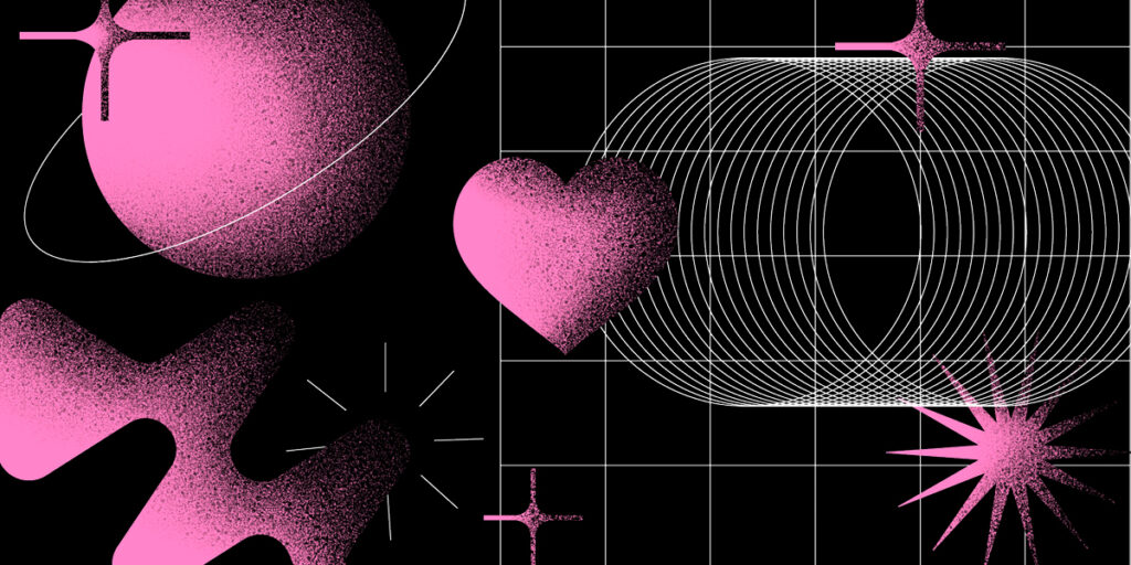
Sometimes less is more. Using flat colour and a limited palette can add a note of sophistication to an illustration which could help reflect a brand’s image and personality.
One of HDY’s Designers said: “Working within a limited colour palette can help an image stand out. Especially when a series of illustrations is required, a fixed and limited colour palette helps to create a sense of cohesion between all images and to achieve a harmonious image.
“Using few colours means they are chosen more carefully which overall gives the image its final impact.”
Body illustration
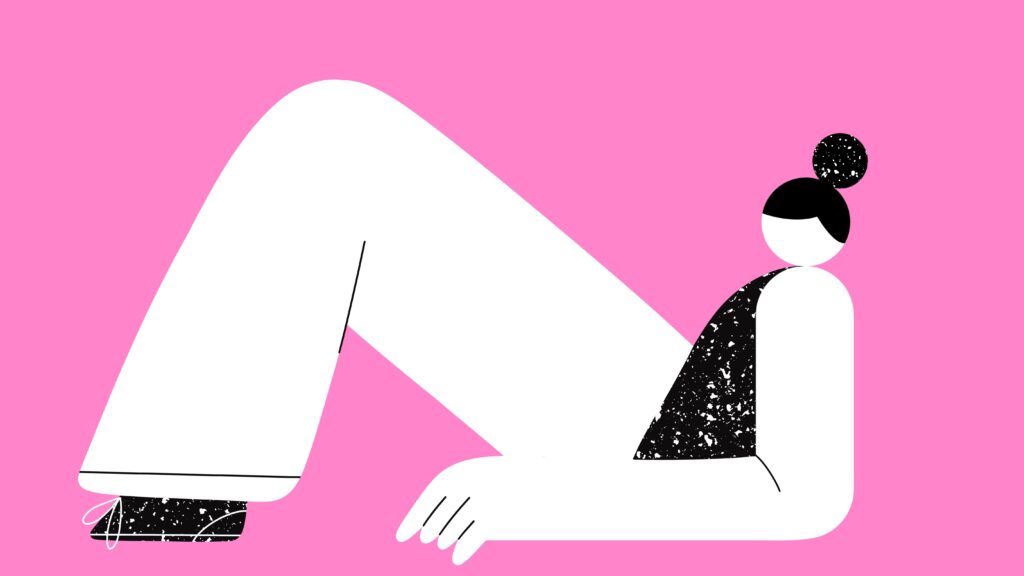
Body illustrations disproportionate in size is a trend that we saw a lot of back in 2021. Still popular this year, designers delivered something creative that sparks more interest than standard life-size human bodies. These have become popular as they relate to trends around body positivity and diversity.
These illustration trends see human bodies drawn with varying sizes of body parts depending on the message being told.
3D realistic illustration
Skeuomorphism is the highly technical term for making items resemble real-life objects. We’ve witnessed this in 2022 as designers create characters and other forms of art that look very life-like.
Some products and concepts may be hard to capture. Transforming items into 3D realistic illustrations allows brands the capability to showcase their products regardless of any barriers, which in turn is more interesting and eye-catching due to its dimensions compared to a 2D model.
Need a helping hand to make sure your content is up to date with the latest trends? Get in touch. We’re only a phone call away!
